

TL;DR:
- Different battlemap styles significantly influence tactical clarity, immersion, and session flow in tabletop RPGs. The most effective maps are clear, simple, and match the story’s tone, often combining printed maps with physical props for balance. Consistent map styles and thoughtful design choices enhance player engagement and trigger memorable, strategic encounters.
Not all battlemaps are created equal. That’s the thing most players and DMs discover the hard way. You lay down a grid, plop some minis on it, and wonder why combat feels flat or confusing. Here’s the truth: battlemap styles explained properly can completely transform how your players experience a fight. Different formats, perspectives, and visual approaches each bring something unique to the table (literally). Whether you’re a first-time DM or a seasoned dice goblin running your tenth campaign, understanding these differences is the secret ingredient your sessions have been missing.
Table of Contents
- Key takeaways
- Battlemap styles explained: types and formats
- Visual perspective and art style
- Battlemap design tips and common pitfalls
- How to choose the right battlemap style
- My take after years of bad map choices
- Level up your table with 1985games battlemaps
- FAQ
Key takeaways
| Point | Details |
|---|---|
| Style affects gameplay | Different battlemap styles directly impact tactical clarity, player immersion, and session flow. |
| Top-down dominates combat | Bird’s-eye perspective is the gold standard for tactical combat because it makes grid use simple and readable. |
| Design clarity beats detail | A clean, readable map with choke points and elevation beats a visually overwhelming one every single time. |
| Hybrid setups shine | Mixing printed flat maps with physical props or terrain pieces creates the best balance of clarity and immersion. |
| Match style to your story | Choosing your battlemap format based on campaign setting and group playstyle makes a bigger difference than most DMs expect. |
Battlemap styles explained: types and formats
Before we get into art styles and design philosophy, let’s talk about the three main categories of battlemaps you’ll actually encounter at a table. Understanding which format fits your needs is step one of the whole journey.
Printed flat maps
These are the classic. Paper or vinyl grids, either blank white with just grid lines or pre-illustrated with dungeon rooms, forests, taverns, and more. The standard combat scale uses a 1-inch square grid representing 5 feet in-game, which aligns perfectly with standard miniatures. Hex grids also appear, typically for overland travel using 6-mile or 24-mile hexes.
Printed maps are affordable, portable, and quick to set up. Double-sided vinyl maps are a fan favorite because they wipe clean between sessions. The trade-off? They’re static. No walls to move, no doors to swap, no verticality unless you get creative with props.
Modular physical terrain
Now we’re cooking. Modular terrain pieces are 3D interlocking tiles made from resin, foam, or cardstock. You can build dungeon corridors, towers, forest clearings, and swap sections mid-session without breaking the scene. Players go wide-eyed when they see actual walls rise up around their characters.
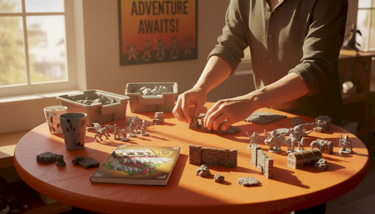
The cost and prep time are real considerations, though. Building a modular terrain library takes time, money, and storage space. Not every DM has a spare room dedicated to foam dungeon tiles (though we salute those who do).
Digital projection and virtual tabletops
Virtual tabletop (VTT) platforms let you display maps on a monitor, TV, or projector. Fog of war, dynamic lighting, animated maps. It’s the cinematic experience of the group. Digital maps are endlessly flexible and can shift scene to scene instantly.
Here’s a quick breakdown to make the comparison clear:
| Format | Best for | Main trade-off |
|---|---|---|
| Printed flat maps | Quick setup, budget-friendly play | Static, no 3D elements |
| Modular physical terrain | Immersive, tactile experience | Expensive, time-intensive prep |
| Digital projection (VTT) | Dynamic scenes, fog of war | Tech setup required |
| Hybrid (map + props) | Balance of clarity and immersion | Requires both physical and printed resources |
Most effective tables mix printed maps with physical props, getting the best of both worlds without the full complexity of an all-modular setup.
Visual perspective and art style
This is where the types of battlemaps really start to diverge in how they feel at the table.
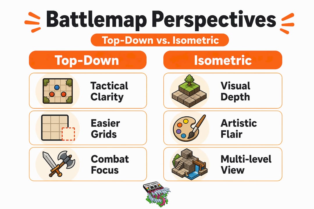
Top-down vs. isometric
Bird’s-eye view (top-down) is the clear champion for tactical combat. Over 90% of tactical combat maps use this perspective because it makes grid alignment intuitive and mini placement unambiguous. You know exactly where your fighter is standing relative to the goblin archers on the balcony. No spatial confusion, no arguments about adjacency.
Isometric maps are gorgeous. They show depth, stairs, and multi-level structures with real visual flair. The problem? Grid alignment gets tricky fast. Miniature scaling complicates grid use on isometric maps, and players sometimes struggle to read movement or reach accurately. Isometric works beautifully as presentation art or for exploration scenes where precise tactical positioning matters less.
Photo-realistic vs. hand-drawn
Photo-realistic maps look stunning in a preview image. Detailed stonework, glistening water, dramatic lighting. In actual play, though, they can backfire. Busy backgrounds reduce gameplay readability, especially on digital platforms where tokens blend into the scenery. Players are scanning for their mini, not admiring the cobblestones.
Hand-drawn maps, by contrast, often strike the perfect balance. They’re thematic, charming, and just detailed enough to communicate the scene without drowning it in visual noise. Check out some inspiring battle map examples if you want to see what “just enough detail” looks like in practice.
The grid problem nobody talks about
The grid itself is a design element that many creators get wrong. It should be thin (around 6-8% opacity relative to your pixels per grid) so it functions as a bookkeeping tool without overpowering the artwork. A thick, high-contrast grid turns a beautiful illustrated tavern into a spreadsheet. The grid exists to track movement and range. That’s its whole job. Keep it subtle.
Pro Tip: When building digital maps, work at 300 pixels per grid on your master file, then downscale before adding the grid layer. This keeps your grid lines crisp and properly aligned rather than blurry or offset.
Battlemap design tips and common pitfalls
Here’s where creating battlemaps for RPGs gets real. Understanding styles is one thing. Knowing how to design or choose them well is where sessions truly level up.
One of the most common mistakes? Over-complicating the map. New DMs spend hours on gorgeous illustrated maps packed with intricate details and then wonder why combat feels chaotic. Clarity is everything. Players need to read the space instantly, not decode it.
Here are the core principles that separate functional maps from beautiful-but-frustrating ones:
- Center the action. Place primary action centrally on the map so players aren’t crowded into corners or fighting across edges.
- Use elevation intentionally. Multiple levels create tactical depth. A raised platform, a crumbling balcony, a sunken pit. These force decisions and make fights memorable.
- Keep walls and obstacles clear. Clean line of sight (LoS) indicators matter more than detailed stone textures. Players need to know what blocks them and what doesn’t.
- Avoid pre-placing DM secrets. Doors, hidden traps, and secret passages drawn directly on player-facing maps remove flexibility and spoil reveals.
- Use modular props sparingly. A barrel here, a pillar there. Physical props add immersion when placed with purpose, not scattered as decoration.
- Match scale to your minis. A 1-inch square that’s actually 0.9 inches because of printer margin drift creates cascading confusion across the whole encounter.
Pro Tip: If you’re printing maps at home, always print a test page first and measure a single grid square with a ruler before printing the full sheet. Even small scale errors compound across a large map.
One more thing worth calling out: a well-designed map supports the narrative through choke points, cover, and varied elevation. It’s not decoration. It’s storytelling infrastructure. A narrow bridge over a lava chasm tells your players something is about to go very, very sideways, and that tension is priceless.
How to choose the right battlemap style
Now that we have all the pieces, let’s talk about putting it together. Matching battlemap styles to your campaign isn’t complicated, but it does require a bit of honest self-assessment.
Here’s a practical framework for making the call:
- Assess your session prep time. Modular terrain looks incredible but demands hours of building. If you’re running weekly sessions with limited prep windows, high-quality illustrated printed maps will serve you better and still look fantastic.
- Consider your system’s mechanics. Grid-heavy systems like D&D 5e and Pathfinder need precise, readable maps. Narrative-light systems with looser combat (like some OSR games) work fine with simple sketches or even theater of the mind with minimal visual aids.
- Know your group’s playstyle. Some players engage deeply with tactical positioning. Others just want to feel the scene. If your group skews cinematic, a beautiful illustrated map matters more than perfect grid clarity.
- Match your battlemap themes to the story. A cursed temple encounter deserves a dark, atmospheric map with crumbling walls and eerie symbols. A mountain ambush calls for rocky terrain and elevation differences. Battlemap themes explained through the lens of your narrative make encounters feel inevitable rather than arbitrary. For more on tactical depth in maps, there’s a lot of nuance worth exploring.
- Lean into hybrid setups when budget allows. Printed maps as the base layer, with a few physical props (barrels, walls, torches) placed on top, is the sweet spot for most tables. You get the immersive experience of 3D terrain without the full modular kit investment.
- Leverage existing resources. You don’t have to draw everything from scratch. Pre-made maps from trusted creators let you focus on encounter design and story, not pixel art. Quality matters here, especially for scale accuracy.
The best battlemaps for games are the ones your players will actually engage with. A technically perfect map your group ignores is worth exactly zero gold pieces.
My take after years of bad map choices
I’ll be honest with you. I spent about two full campaigns convinced that more detail equaled better maps. I’d spend a Friday night illustrating every mossy brick in a dungeon chamber and then watch players spend three seconds looking at it before asking, “okay, where’s the dragon?”
What changed everything for me was adding a single foam wall piece to an otherwise flat printed dungeon map. Players immediately started reasoning around the wall. “Can I get line of sight if I move here?” That one prop did more for tactical engagement than three hours of illustrated stonework ever had.
I’ve learned that visual complexity is a trap. The maps I’ve seen generate the most genuine excitement are often the simplest ones with the most interesting spatial choices. A narrow bridge. An asymmetric room with one great hiding spot and one terrible chokepoint. That kind of design lives in the layout, not the artwork.
My advice? Pick one format and one visual style that fits your prep routine and campaign tone, then stay consistent. Your players will adapt to your map language quickly, and that consistency actually helps them engage more deeply with the tactical space. Experiment with props and hybrid setups when the story calls for something special, but don’t feel like you need a Nat 20 map every single session to run an incredible game.
— Lenny
Level up your table with 1985games battlemaps
Ready to stop improvising with hand-sketched graph paper and start dropping genuinely stunning maps on your table?
At 1985games, we’ve built a collection of terrain map titles designed specifically for the way TTRPGs actually get played. The Dungeon Craft series covers a huge range of encounter settings, from sprawling dungeon corridors to cursed, dark-fantasy environments you can explore in Dungeon Craft: Cursed Lands. Need something with dramatic visual contrast and tactical variety? The Snow & Wood BattleMap delivers exactly that. Every map is built to scale, print-ready, and designed to support gameplay first and aesthetics second. Because that’s what actually matters at the table.
FAQ
What are the main battlemap styles for TTRPGs?
The three main battlemap styles are printed flat maps, modular physical terrain, and digital VTT maps. Most tables combine elements of two or more styles for the best experience.
Is top-down or isometric better for tactical combat?
Top-down is better for tactical combat. It keeps grid alignment clear and mini placement unambiguous, which is why it’s the preferred format for over 90% of tactical RPG combat maps.
How detailed should a battlemap be?
A battlemap should prioritize clarity over detail. Clear walls, readable terrain features, and subtle grids matter more than intricate artwork. Over-detailed maps often hurt gameplay readability.
Can I mix digital and physical battlemaps?
Absolutely. Hybrid setups using printed maps as a base layer with physical props on top give you both tactical clarity and tactile immersion without needing a full modular terrain library.
What grid scale should battlemaps use?
Standard tactical battlemaps use a 1-inch square grid where each square represents 5 feet in-game. This scale aligns with most standard miniatures used in D&D and similar systems.